Your logo or event image is more than just a design—it’s the face of your brand or celebration. It’s the first impression, the spark that captures attention, and the visual cue that tells your story in an instant. A well-crafted logo or image creates recognition, builds trust, and sets the tone for everything you represent. Whether you’re launching a company or hosting an unforgettable event, the right design ensures you stand out, leave a lasting impact, and connect with your audience in a way that words alone can’t achieve.
Updating Logos
While the organization’s logo served them well, it was time to bring them into a more contemporary look – one that could support a variety of background colors. Colors chosen were in the color palate of the parent organization, with the exception of the green, which was tied to the sport.
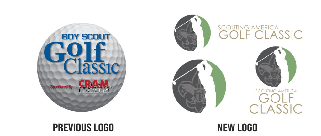
Logo Evolution
The original logo featured stark colors, but its overall concept showed great potential. Rather than starting from scratch, the key elements of the design were preserved, allowing the logo to evolve into a more modern and polished version while maintaining its core identity.
Rebranding
The name Camp Card served the members well, but leadership discovered that not all the proceeds were used for camp – sometimes it was used for day trips and equipment. It was time for a name change. We chose basic white typography so that the backgrounds could be changed each program year giving users instant identification of the current year’s card.
The Art of New Designs
A Logo To Unify
While part of a National organization, the local council (chapter) wished to differenciate themselfs and unit their membership under one flag so-to-speak. It was important to hold true to the brand colors of the parent organization, but also wanted to reflect the local culture of their membership. As such, the more notable architecture of the skyline was recreated against a linear sunset, with council number prominently displayed atop the single white star revered on the Texas flag.
Complicated Name, Smart Design
A long company name presents unique design challenges, particularly in achieving a balanced and visually appealing fit. In this example, modernized variations of primary colors replace the traditional palette, adding a contemporary touch. From a practical perspective, limiting the logo to four colors plus black is a strategic choice. This streamlined palette not only maintains visual clarity but also ensures seamless conversion to black and white for merchandising—a solution educators might recognize as rooted in the principles of color theory and design efficiency.
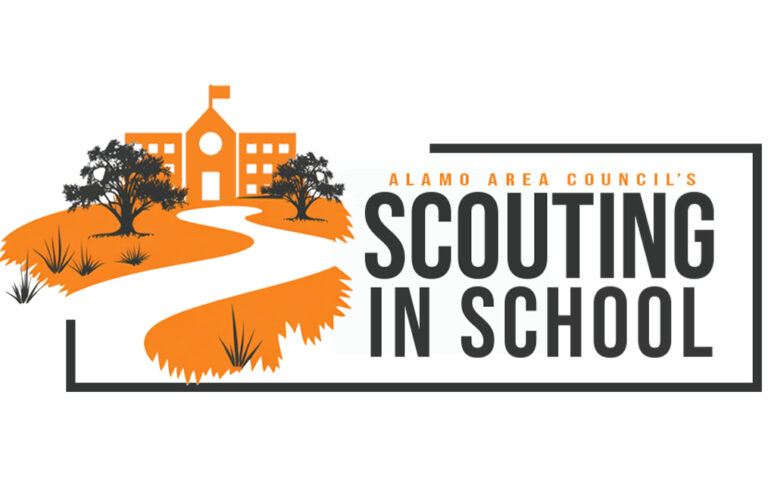
Make An Impact With Two Colors
Compact designs are ideal for ensuring quick recognition in crowded settings. Orange, a scientifically proven attention-grabbing color, plays a key role in capturing interest. While the organization’s name represents its mission, the design draws customers in with the scenic imagery of the path leading to the school, seamlessly blending the organization’s identity with its purpose.
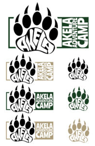
Whimsical, Yet Practical
This camp, Akela—named after the wise wolf leader from the beloved children’s book The Jungle Book—is tailored for children in fourth and fifth grades. The design prominently features a paw print, with the word “Akela” artfully integrated into the center pad, serving as the focal point of the logo. In such cases, where a distinctive design element stands out, simpler, single-color logos are often used as recognizable, stand-alone graphics. However, incorporating several colors consistent with the original brand is equally important. These colors create a visual connection to the brand’s identity, evoke familiarity, and ensure consistency across all marketing materials, enhancing both recognition and trust.
Having several options for the logo is offers more flexability when designing future marketing pieces.
When It Works, It Works
The appearance of a logo can change dramatically based on its background, especially when applied to merchandise. For instance, a design that may appear simple on its own can become striking and eye-catching when paired with carefully chosen shirt colors. While creating logos for long-term use or business purposes often requires a different approach, the process used for this event was the most practical and effective choice.
Integrity matters: All of the material on this page was created and implemented by Jenn unless noted otherwise.